info@spgtechsoft.com






Why Indian Businesses Can’t Ignore Mobile-Friendly Websites
Whether customers search for restaurants, clothes for kids, local services, or software companies of Indian origin, they often visit the business website from their mobile devices.
If the page loads slowly, they may simply leave and look elsewhere.
In India, people use their mobiles to compare products, book appointments, pay bills, and contact companies.
For brands, that makes a good mobile website experience difficult to ignore.
This is where mobile-friendly development services can help. These services focus on making the website more user-friendly on the devices that customers already use.
What is a mobile-friendly website?
A mobile-friendly website is one that can be comfortably viewed on a smartphone or other small-screen devices without forcing users to zoom in, scroll sideways, or move around the page just to complete basic tasks.
Content should scale to fit available screen size, while menus, forms, images, and buttons remain easy to use.
This is different from simply shrinking a desktop website. People also interact with websites differently on a phone and a desktop.
The layout needs to account for touch controls, smaller screens, and slower connections.
Why do Indian businesses need mobile-friendly websites?
For many businesses, the website is where a potential customer decides what to do next.
Someone looking for a local clothing store like Bluorng might check its collection on their phone before visiting. An online shopper, meanwhile, may go from product discovery to payment without ever opening the desktop version of the website.
A poor mobile experience can affect all of these journeys.
Here are some areas where businesses should pay attention.
1. Customers should not have to fight with the website
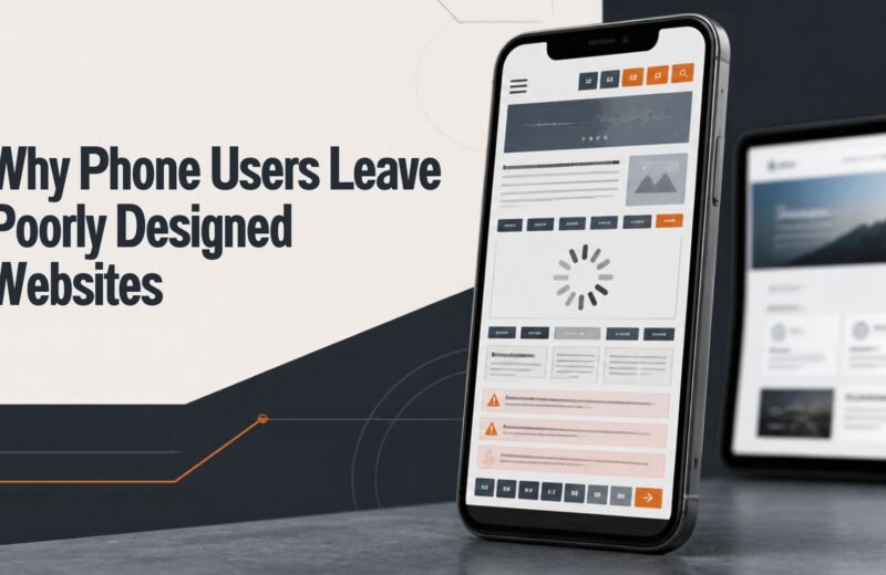
This sounds obvious, yet plenty of websites still make basic tasks unnecessarily difficult on smartphones.
A menu that’s difficult to tap or a form that takes several screens to complete can quickly become annoying. Sometimes an important button is simply buried below a huge image.
A customer should be able to open a website and understand where to go next without figuring out how the interface works.
2. The website needs to load properly on mobile networks
A visually impressive website can still create problems if it relies too heavily on large images, animations, videos, and unnecessary scripts. These issues become much more obvious when a visitor is browsing on a slower or unstable mobile connection.Tools such as Google PageSpeed Insights can help businesses identify website performance issues.
3. Navigation needs to be simple
Desktop websites have more space to display. Smartphones don’t. This means businesses need to decide which sections actually matter to their visitors.
A restaurant website, for example, might only need a menu, location, table booking, contact details, and an about page.
For larger brands, a search function can also make it easier for visitors to reach specific information.
4. Make contacting the business easy
Businesses need to understand that not every website visitor wants to buy something immediately.
Some may want to ask a question, request a quotation, schedule a meeting, or check whether a service is available in their area. So, for an Indian local business, a visible phone number or WhatsApp option can sometimes be more useful than forcing every visitor through a lengthy inquiry form.
5. E-commerce businesses need to pay extra attention
Mobile usability becomes even more important for e-commerce sites because a customer can discover products, compare them with alternatives, and complete the purchase without ever switching to a desktop.
Imagine someone shopping for a kurta from a D2C fashion brand like Bunaai.
On the product page, they need enough information to judge the product, choose the right size, check delivery details, and understand what happens if they need to return it.
6. Product information should be easy to scan
Mobile users generally don’t want to read a huge block of text before understanding what a product or service offers.
Instead of making potential customers read everything, brands can put the most useful details where they are easy to spot. This could include pricing, sizing or specifications, delivery information, reviews, and a short description.
This matters even more for Indian e-commerce brands selling products where customers need specific information before purchasing.
7. Forms should not become a barrier
Forms help to generate leads, but they can also become one of the biggest problems on mobile. If a visitor only wants a callback or a quick quotation, asking them to fill out eight different fields can add unnecessary friction.
Keep the form focused on the information the business actually needs at that stage.
8. The mobile website also affects trust
Customers often make quick judgments about businesses based on their websites.
A mobile website with broken images, outdated information, inconsistent fonts, or buttons that don’t work properly can raise doubts in customers’ minds.
Keep basic details such as contact information, pricing, business hours, policies, and service information up to date. This way visitors don’t have to hunt for them.
What should businesses check before developing a website?
Before development starts, brands should have a clear idea of who the website is being built for.
A site aimed at college students will have different content and navigation requirements from one designed for corporate buyers.
It is also worth deciding what visitors are expected to do once they arrive. That could mean buying a product, requesting a quotation, booking an appointment, or simply calling the business.
Common mobile website mistakes
Even businesses that understand the importance of mobile design can make avoidable mistakes.
Buttons that are difficult to tap
Small buttons can be frustrating on a phone, particularly when several clickable elements sit close together.
Oversized image files
High-quality images are important for e-commerce and visual businesses; however, unnecessarily large files can slow down a page.
Desktop-focused layouts
A design that looks good on a large monitor may not work on a five- or six-inch screen.
Way too many pop-ups can be distracting
Pop-ups can be useful for lead generation, but showing way too many can be frustrating for visitors.
Contact details that are hard to find
Details like phone numbers, email addresses, and WhatsApp options need to be easy to locate.
How Indian businesses can improve their existing website
A complete rebuild is not always the first step.
Indian brands can start by checking the website on several smartphones and looking for obvious problems. Try searching for a product, opening the main menu, submitting a form, checking a service page, and completing the checkout process.
Then look at analytics to understand where mobile visitors are leaving.
Most problems can be fixed without starting from scratch. Change the navigation, simplify a form, compress images, or move a crucial call-to-action to fix a weak mobile experience.
But if the deeper issue requires a rebuild of the site, the brand needs to consider more than the initial visual design and focus on performance and how well the site is structured.